Monday, 7 May 2012

THE FINISHED PRODUCT

We made it!!!!!!!!
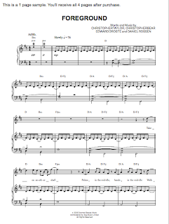
Have a look at Peter&The Wolf in his new single 'FOREGROUND' from the album 'Letters'. Soon available in every music store.


Thanks to everyone involved - especially the actor Taymour Williams and the Media crew for support at every stage of  production.

Friday, 6 April 2012

FINISHED PRODUCT: Digipack and Promo Poster

This is the digipack of the album and the poster of the promo campaign.We created it using Photoshop.

Outside front: Polaroid and signiture
Outside back: hand written song titles, info about production and publishing companies, bar code.
Disc in style of red wallpaper seen in 'Foreground' music video.
Inside cover: scribbling by the artist conveying his mental confusion + under the disc, plain white background again with the artists' writing mentioning his name and album title.


We wanted the digipak to remain coherent with the music video and did this by using scribbles,  a polaroid picture and similar color schemes.

Wednesday, 8 February 2012

EVALUATION Task 4 - Director's Commentry: How did you use new technologies in the construction and research, planning and evaluation stages?

Director's commentry:


The script:

In our music video we shot on two locations, one of them, and the first one you will see was shot in the studio.
The studio setting of our music video was filmed in a warmly lit environment, and when we got around to editing the video we realised that we didn’t like how orange the footage had come out. In order to change this we used a programme called ‘Color’ to pull down the amount of reds in the footage leaving it with the cool blue colouring. This gives a similar atmosphere to the other examples of indie films we had watched, from artists like Bright Eyes and Patrick Wolf that we looked at on online sources such as YouTube, MySPace, google, soundcloud, iTunes and official websites to make research into the indie music industry to collect inspiration and knowledge about existing artists and especially their music videos which contributed to some stylistic ideas of our video.
For most shots in the studio we used a Sony F3 camera with a prime lens as it is very useful for so called beauty shots (For smooth skin etc.). For the focus pulls we had to change the lens as you cannot zoom with it.

When changing our location to the house we noticed that the lighting was quite warm again and therefore we put some blue tones on top of the lights to make the images look colder. Again we used the Sony F3 camera, because of its clarity and amount of details when having a close ups. When shooting the ballerina we took the Sony NX5 camera, which does not have the same quality like the Sony F3 one but it was useful for us because we were shooting two scenes at a time in order to get more material done in less time. So while one part of our group was shooting Peter, the other group was shooting the ballerina dance sequence. This time we did not have the equipment of a CD player so that we had to use our phones in order to make use of a playback.

For the special effects when bringing the flowers back to life we used After Effects in Final Cut Pro which allowed us to cut out Peter and arrange the background so that it the fading into the live flowers look ‘natural’ to us. We put everything back in place and created a change that look ‘right’ for our eyes. In order to lead the viewers look we made use of a zoom as well. This process is called Masking.
After this scene we had another bit where we made use of after effects. That was when he is finding the Polaroid picture between the books which is then starting to move. In order to create the impression of a moving image we had to do a similar thing to the still image in After Effects. We used an empty Polaroid so that we were able to cut out the black bit and place the video clip into the empty frame.
Even though Peter tried to be still, his hand was still moving a bit, therefore we had to freeze the image (his hand) and only have the inserted clip moving. The interest of the audience will be focused on the clip so that they may not notice the fact that we froze the other image. Over all we had to images in one.

Looking at the very last bit of our video you might notice that we had to slow him down a bit when walking out of the door. Again we did that with the help of Final Cut Pro. (Slowmotion)
Still of digipak:
We wanted to repeat the theme of having a Polaroid in the Digi pack, because we thought it could be one of his trademarks that is going to be repeated throughout his image. Therefore we took a photograph of him wearing a wolf hat and change the colours in Photoshop so that it had a vintage style to it. After having turned the photograph into an old fashioned picture we inserted the image into a digital Polaroid frame. On the front cover we decided to leave it with a Blanc front cover with nothing on it but the Polaroid and on the back we did the same thing but with the back of a Polaroid. On the back we had written the tracks of the CD in his handwriting. The inside included lots of his personal writings that were thanking the people that supported him. In order to make it personal we had him coming in again and he had to write some the track list and the tank you … list. After he had written all that we scanned it into the computer so that we were able to work on it digitally and insert all the letters etc. into the Digi pack. On the other side of the cover, as well as on the CD itself we put in the wallpaper of the house setting. We took a picture with a Canon camera beforehand and then we did some colour changes as well in order to create this vintage look. In this case we made use of Lightroom which helped to change and contrast Hue and Saturation as well as the colour settings.

Show video diary:
On the set, we also made a short video diary t5o show some behind the scenes footage. We filmed this with an iPhone 4S and cut it on iMovie on a Mac.

Onto blog
• Pre-production: When we discovered…
• Onlining/offlining process
• Evaluation process and used technologies

Thursday, 2 February 2012

EVALUATION Task #3: What have you learned from your audience feedback? Step 1 - Questionaire


Feedback questionaire
- Paula, Leyla, Helena, Grace

Dear respondent,
Having just seen our music video, please will in the following questionnaire, as honestly and complete as possible, according to your opinion. This would be very helpful to us as an A2 media group because we need some constructive criticism and feedback on our product.

About you:
Female      Male
Age:
Nationality:
What’s your favorite music style?
Do you prefer....
live peformances
  music via iPod/TV
clubbing

1) Did you enjoy watching the video, or did you find it boring? If so – at what points did you lose your interest?
2) Did you think the video is too abstract or absurd? Yes or no?
3) If you could identify a narrative within, what was it?
4) What are the video’s strengths that would make it successful in the real indie-music industry?
5) What do you think about the artist? Do you sympathize with him? Would you like to see more of him and his work?
6) Is there anything in the video you would have liked to see? E.g. more performance, more fast paced shots, more naked skin??;)
7) What was your favorite moment?
8) Please circle on the number which most closely reflects your opinion of the artist:

Vulnerable
1
2
3
4
5
Strong
Introvert
1
2
3
4
5
Confident
Creative
1
2
3
4
5
Boring
Ambiguous
1
2
3
4
5
Masculine
Serious
1
2
3
4
5
Boring
Depressive
1
2
3
4
5
Happy
Mysterious
1
2
3
4
5
Stereotype
Mad
1
2
3
4
5
Funny

 
Thank You very much!

Monday, 23 January 2012

EVALUATION Task #2: How effective is the combination of your main product and ancillary texts? - Step 3: Final

EVALUATION Task #2: How effective is the combination of your main product and ancillary texts? - Step 2: THE SCRIPT

Evaluation Task #2: How effective is the combination of your main product and ancillary texts?

• Richard Dyer’s theory of star image
• What’s his star image?
• How is his this sold through video, digipak and poster?
• How do they work together?

Richard Dyer&Star image
Richard Dyer is an English academic who specialises in cinema and analysing the extraordinary world of ‘stars’ in the entertainment industry. The term star refers to artists who live their life publicly due to their work and are therefore seen as almost superficial creatures. He argues: ‘Stars are commodities produced and consumed on the strength of their meanings’ making the point that the artists’ image needs to be well established which is done through the marketing campaign around the music. The star images consist of particular characteristics of the artists, for example rebellious/anti-authoritarian, plus their looks and their music genre. Sometimes, the background of the artist is very important as it can contribute to the image, giving reason for certain behaviours. A pop-star is different to a performer, Dyer claims, as a star is promoted to this status by management and has an identity or persona which is not restricted solely to their musicianship.
A star is constructed out of 2 paradoxes, Dyer says. Number one is the star has to be simultanously ordinary and extraordinary, so that fans can look up to them and adore them but also relate to them as human beings. Paradox number two says that the star has to be absent and present at the same time, the fans should feel close to them, have posters on the wall and watch interviews, but also know in the back of their mind that they would never get to know the star they admire. This is how the star image works but it is of course different applied depending on what kind of artist is dealt with.

Identify the artist & image/3 key qualities of image
Peter & The Wolf is an indie artist and therefore I would describe the constituent features of his star image as creative/talented, sophisticated, intelligent and original. Because of the importance of creating a star image we created a campaign for Peter & The Wolf to sell both his music and image. This includes a music video alongside the new single, a digipak of the new album and a poster to promote the album release.
These three products promote the star in different ways each but overrall work together.

Identify our target audience
The audience we target with our artist is aged between 17 and 35 years, male and female, and a more intellectual and middle-classed audience. As it’s a calm and easy music sung by an unintrusive singer it will appeal to an group of people that might be occupied with a job and listen to calming background music, or to younger people that are rather individual and don’t like following the mainstream music.


How are these qualities shown?
Our main product is a music video which is supposed to promote the song by creating a visual. This encourages repeated consumption and brings it to the grand advertising platform, television. Our aim was to make a music video that was original and different. It is artier and more melancholic than most videos which tend to be very fast paced and colorful. We focused on strong, well composed visuals, such as the shot when the artist stands behind the perspex covered in scribbles and the stark contrast between the ballerina in the white room and the color of her lips and mask. These visuals aim to create a special atmosphere and give the music video an intense, serious and artistic mood that provokes emotions and thoughts in the viewer. We made these creative decisions to emphasize Peter’s own image and style, which is a calm, passionate musician who seems not to care about the world. The muted colors, naturalistic lighting and a realistic environment promote the idea that Peter might be slightly mad or depressed. The focus is only on Peter which reinforces that he is a solo artist.

The digipak was created with the intention of maintaining the same style as the music video. We did this in order to construct a unique selling point and a face of the whole campaign as he is a new artist. For example, we used the artist’s hand writing for the font of the cd cover and inside layout just like we used his scribbling in the music video as an element in the music video. This makes the digipak more personal and individual. We also used the red wallpaper that was seen in the video as part of the layout in the album which contributes to our aim to create the face of the campaign. All the elements of the digipak help to build and sell the artist’s star image.

The poster’s purpose is to advertise the artist, in particular his new album that includes the music video song. The photo is chosen from a shot we took on set and strongly conveys the mood of the music video as well as reinforcing Peter’s image and personality of being sophisticated, serious and deep.

All of these different media products work together to construct the image of Peter & The Wolf by creating a face and look for the artist which is substantial and stays in consumers heads. As his music is not mainstream, the target audience is a niche audience that is already interested in indie music. All of these produced media are made in order to promote and sell his music which is the final goal!

Comparison with real artists
In terms of image we took some inspiration from artists such as Bright Eyes and Patrick Wolf, who are independent alternative musicians that have similar personalities and star image to our artist Peter and the Wolf. Those musicians are not appealing for a wider audience.
We got inspired by music videos from Birdy’s cover version of Skinny Love and Patrick Wolf’s ‘House’ for our location shots. The main inspiration for our studio shots came from Bright Eyes video ‘Lucky Easy Free’ which we interpreted into our concept.

Monday, 16 January 2012

EVALUATION Task #2: How effective is the combination of your main product and ancillary texts? - Step 1

Star image of Peter & The Wolf:

  • creativity/talent
  • sophisticated
  • intelligent
  • originality
is constructed through the video, the poster and the digipak.

Compared to existing artists such as Johnny Flynn and SoKo.


Tuesday, 29 November 2011

Friday, 25 November 2011

THE MAKING OF - Peter&The Wolf

Here is a little clip from behind the scenes of our film set... I hope this achieves to give an impression of how our set looked like and an atmosphere of how we worked - efficient, joyful and professional!
Enjoy!

Tuesday, 22 November 2011

Call sheet

Here's our call sheets. I created them to provide a professional looking overview of the day with the order of scene we'll film and who is responsible for what as well as what times breaks are and when the actors have to be ready and stand-by.


Account #3: The Shoot - Part2

Wednesday, 23rd November

Shooting time: 10am - 4pm
Location: Leith Hill (old boarding house) interiour
Cast & Crew:
same as before

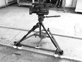
The day started with a lot of last minute procurements of props, such as a frame, loads of old looking books and other things to supply the empty house with a bit of life. Also, we wanted to shoot with two cameras and our original idea for the house part was to track the artist walking through the house and exploring it and to underline this we chose the technique of tracking with a dolly. But - the dolly is very complicated to set up which would consume a lot of time and therefore we had some discussions with our music video enabler, Luke, if we should take it our not. In the end, we followed his advise and didnt take it.... Which turned out to be okay as we still managed to create shots that conveys the feeling of following him through the rooms. 

This is a dolly:


 And this is the HD camera with tripod on 'Eazy Dolly' as dolly replacement:
(which didn't work as the floor was too bumpy making the camera shake)


Evaluation
I think this day went even better than the first shooting day. We were more organised and knew more exactly what we wanted. Also, we had two cameras and split our group in two units to film simultanously which saved a lot of time! First unit was Grace, Luke and me with the bigger camera filming the ballerina scene and 2nd unit Helena, Leyla and Matt doing the shots with Taymour.


Account #2: The Shoot - Part 1

Thursday, 17th November

Shooting time: 1 - 6pm
Location: School, filming studio
Cast: 
Taymour Williams - main solo artist
Sam Hindmarsh - hand double
Crew:
Paula - director and producer/location manager
Helena - cinematographer
Leyla - director and cinematographer
Grace - associate producer/location manager
Media guys (Luke, Matt, Scott, Dan) - Set design, lighting, cinemtographer


To relax our main artist, we started with his hand double for the CU shots of the hands playing piano to make Tay feel comfortable around the set. Here are the keys we looked up online for him -but in the end he was so good that he just listened to the song and found them out himself and even played them on a piano which didnt make a sound.


Then we started to film the performance bit with Tay sitting on the piano and lipsyncing and we shot lots of different shots of performance to put in later as alternative shots. 

At one point we thought it would be cool to just turn the piano around! As you can see here.... potential for a digipak cover?! 

* pic piano tipped

About us as a team and the set atmosphere... We didn't set the roles for each of us before we began to film. But somehow our tasks and responsibilities just evolved and I think we worked quite well together, also with the media team. 


  • Helena took care of the camera and the cinematography most of the time which she is really good at and has lots of experience with. She also contributed to the directing job and came up with lots of good shot ideas. 


  •  I was in the directing position talking to the artist, giving him advise and some guidelines what to do, and also made myself responsible for the schedule and shot lists to check that we do everything we need in the available time. 


  • Leyla was directing as well.


  • Grace was busy with some late changes we made or difficulties we faced, such as supply missing props and she also took care of the playback working efficiently - as well as keeping the actor in a fun mood ;)


Evaluation
What went well?
Surprisingly, I thought a big issue would be the time management but actually that was something that was very well managed! Also, I was really pleased with our idea of scribbling on the sheet of glass infront of the camera, which looked better than I thought it would!

What was difficult?
I think, getting our solo artist into a comfortable feel infront of the camera was quite a challenge. It was our fault in some ways as we didn't spend a lot of rehearsal time with him and as he is not a singer or a musicien it is quite hard to act and sing infront of a camera infront of many people if youve havent done it before. So, that is definitely something I would address more attention if I would do it again. 
Also, our team sometimes wasn't quite the same opinion, it was 2 against 2 at some points and that just should not happen on the set, on the important day!


One of my favorite sequences... 


Monday, 21 November 2011

Account #1: The final preperations

It was Tuesday before the first half of the shoot on Thursday, 17th November and we still havent visited our location.... So this was what we did on that day - and we were very pleased!
It's an old building called 'Leith Hill' and the interiour is exactly how we wanted it to be! Here are some pics.


On Wednesday, we went to the film studio of our school which is going to be the other location to set up the set- our white box. We put in a white floor, white walls, and a white door which we both had to paint a bit whiter and carried in the piano shell which was heavy thing to do.

This was while building it....


Evaluation
What I should have done differently?
I would say, we were lucky that we loved the location because if we would have found really bad we would have had one day to sort out something else... so timing management for such an important thing should be kept an eye on.

What went well?
I enjoyed being in the process of setting up the set myself as I felt very much involved in my production than just the set designer doing everything for us and then we just come to shoot. Also, we still had influence on where to put stuff and the size of the set so that was important.

Friday, 4 November 2011

Lighting/set design

Location: Studio

We want bright lighting, almost overexposed white lighting and white walls like a white box to contrast it with the purple color we'll put on the glass and the simplicity with the piano as only prop plus the door.

I just looked at some music videos to find some more inspiration how the set and lighting should look as an end product and I found these....

1) Rihanna - 'Rockstar'


I love the lighting focusing on the strong grey and black tones which I want to come out in my video as well. I also really like how RIhannas skin looks like, almost a soft surface and a bit unnatural and shiny.

plus the strong purple like in 'Sin City' they do it with the colors.


Location: House, Leith Hill
In Leith Hill we are going to keep the lighting naturalistic. I want o experiment with some effects though, such as making the image into a grainy old fashioned image with some like cracks in the picture and unexpected lighting shifts to make it seem a bit dreamy and noit quite from this world, or from another time.

Seen in:
1) 'Death Proof' - Tarantino

2) Gossip Girl scene(from 0.27s)


  • grainy image - the whole movie is a bit edited as an older film shot with not as developed technology cameras which gives the image something retro and old fashioned... It looks very good I think and could convey the atmosphere of the house even better. At some moments the image could be granier and at some less.
2) 'My Bluberry Nights' - Won Kar Wai


  • the colors - colorful but at the same time not too bright and a bit washed out/faded, giving some warmth
  • the use of paces - at some points it turns into slow motion but a fast slow motion that conveys a very intense or emotional mood. I definitely want to use that at some moments in my video in the house, all of sudden the ballerina turns and dances or he walks around the house or drops somethingt in a slower/ jumpier pace...

Saturday, 22 October 2011

Mood picture...


I just found this album cover photo of Grinderman, an australian band, and thought it would suit my invented artist quite well and kind of demonstrates a mood or a meaning or maybe just a visual that could be related to 'Fortune's Fool' Peter. 


Monday, 17 October 2011

Feedback

The blog is excellent with plenty of detail and a clear sense of progression from the initial idea, through the different variations and on to (what I hope is) the final concept.  There is a very clear sense of research present which feeds into comprehensive planning materials.  You have also included reflection on how feedback at various stages has had an impact on your creative direction.

James

Wednesday, 12 October 2011

TO DO!

Props List - Who gets what?

1.     Costumes
- skinny black boys jeans (Tay - Deadline: Fr 11thNov )
- ballerina costume (I'm making it myself - Deadline: Friday 18th Nov)


2.    Props
- purple color and pen (art department / order - Wednesday 9th)
-> try it out
- painting (Jess is making it - Deadline Monday 14th Nov)
- Ballerina box (Leyla/Grace - )
- photo of peter for cover (Grace, between 14-19th Nov)
- lantern (Paula - Deadline Monday 14th)
- flowers dead & alive (Cranleigh-Monday 21st )
Music
- lyrics to Tay
- piano chords to Sam/Freddy


Price total:
Price each: Me: £15 + £10 + £8 + £13 =£5 = £51/4= £12,75

School: shelf, books, glass, frame, chair

Tuesday, 11 October 2011

Shooting schedule incl. location and shot details


Locations

1. Studio as. 'asylum' or cell - where the performance takes place. 

-> Just without the soft walls!
  • black piano
  • a door
  • sheet of glass in the front of the camera - looking through it on the studio and the artist writes on it
  • pen
  • color? purple - climbing up walls and glass
  •  set-up #1: performance, Peter and piano
  •  set-up #2: only piano keys playing by themself
  •  set-up #3: Peter behind glass, writing on it
  • (set-up #4: white walls getting colored/ Peter body painting, painting on glass, throwing himself on the walls, playing piano with colored hands)

Shot numbers from storyboard
1 - 10 (dissolve into house location), 12, 15, 16, 17, 31, 32, 33.


2. House, Leath Hill as. the artist's imagination/peaceful world where he is a good person and has the power of rejuvenating things and bringing 'dead' things alive again.


  •  set-up #1: window, overshoulder on hands wiping the glass leaving purple hands  + purple curtains
  •  set-up #2: room with ballerina, quite empty, shelf with books - fixing doll's arm, throw up, shot on legs of real ballerina landing -> leaves purple, real ballerina has color on herself, 
  •  set-up #3: fireplace, rocking chair, picture -> picture hangs slanted, puts it straight and colors refresh
  •  set-up #4: rotten flowers -> alive beautiful flowers: vase is fallen over with rotten flowers, puts it back up, leaves hand prints and flowers become alive
  •  set-up #5: rejuvenation
  •  set-up #6: rejuvenation
  • set-up #7: corridor, wallpaper, door at the end+light, color on hands on walls


Shot numbers from storyboard